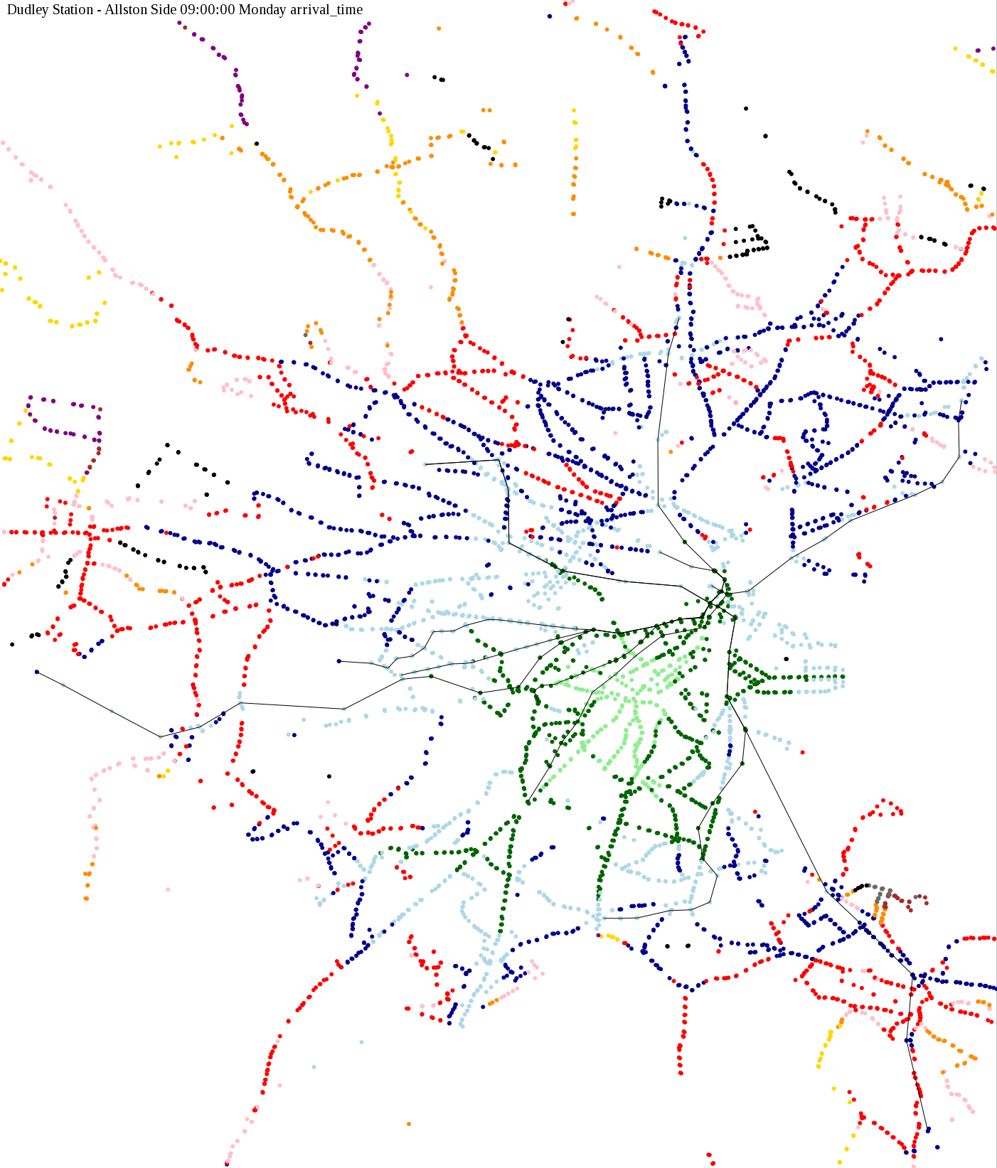
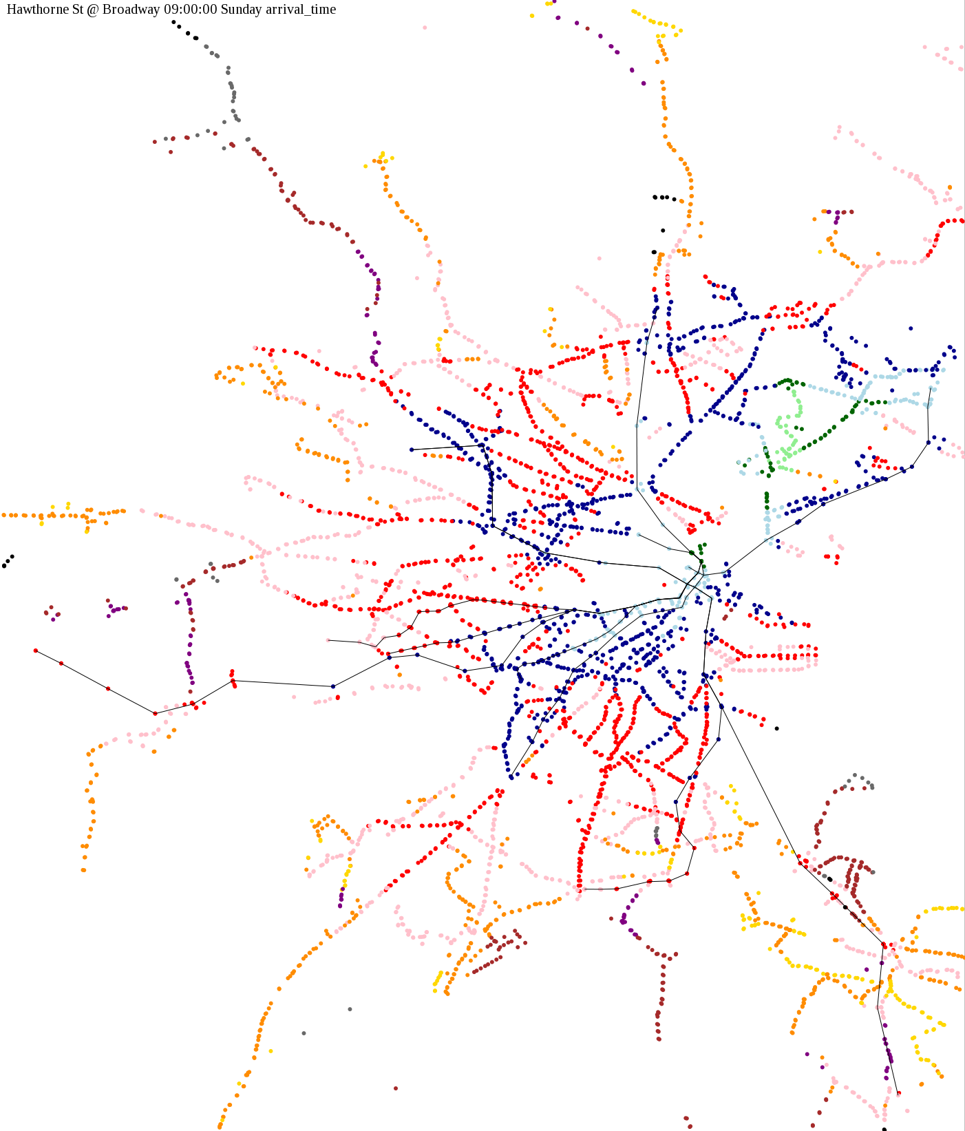
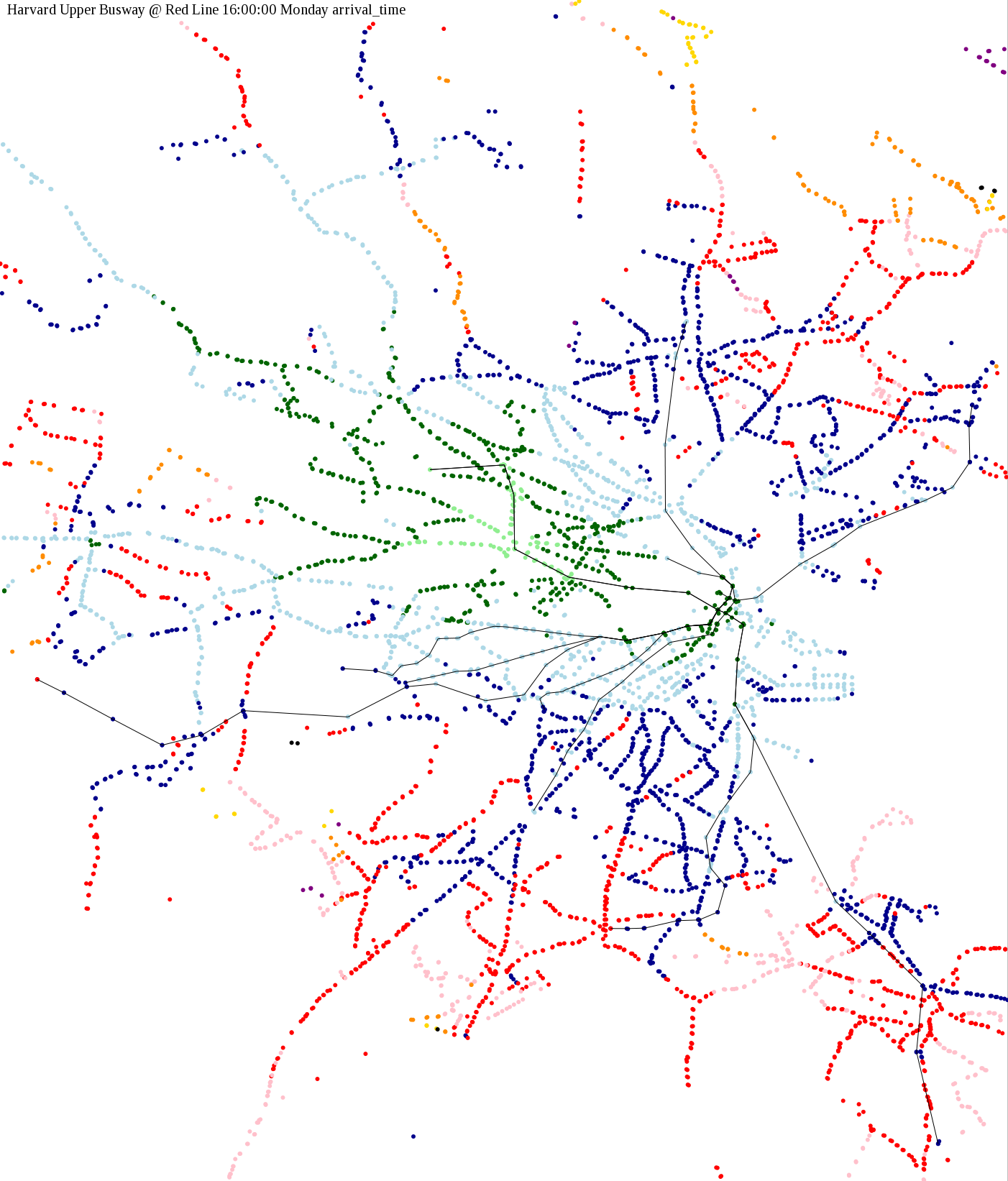
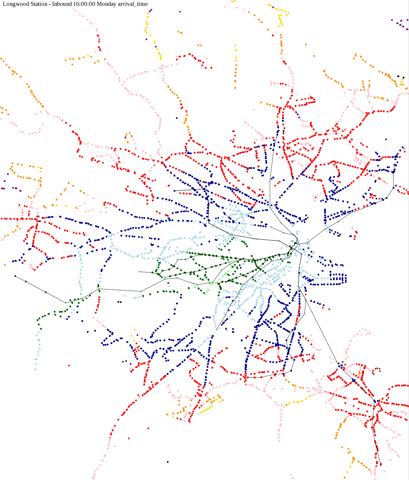
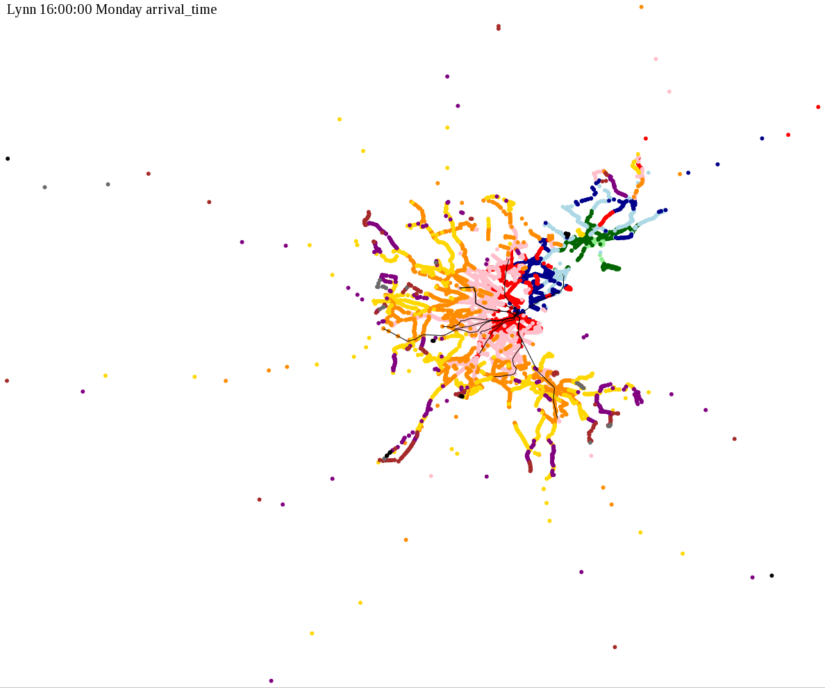
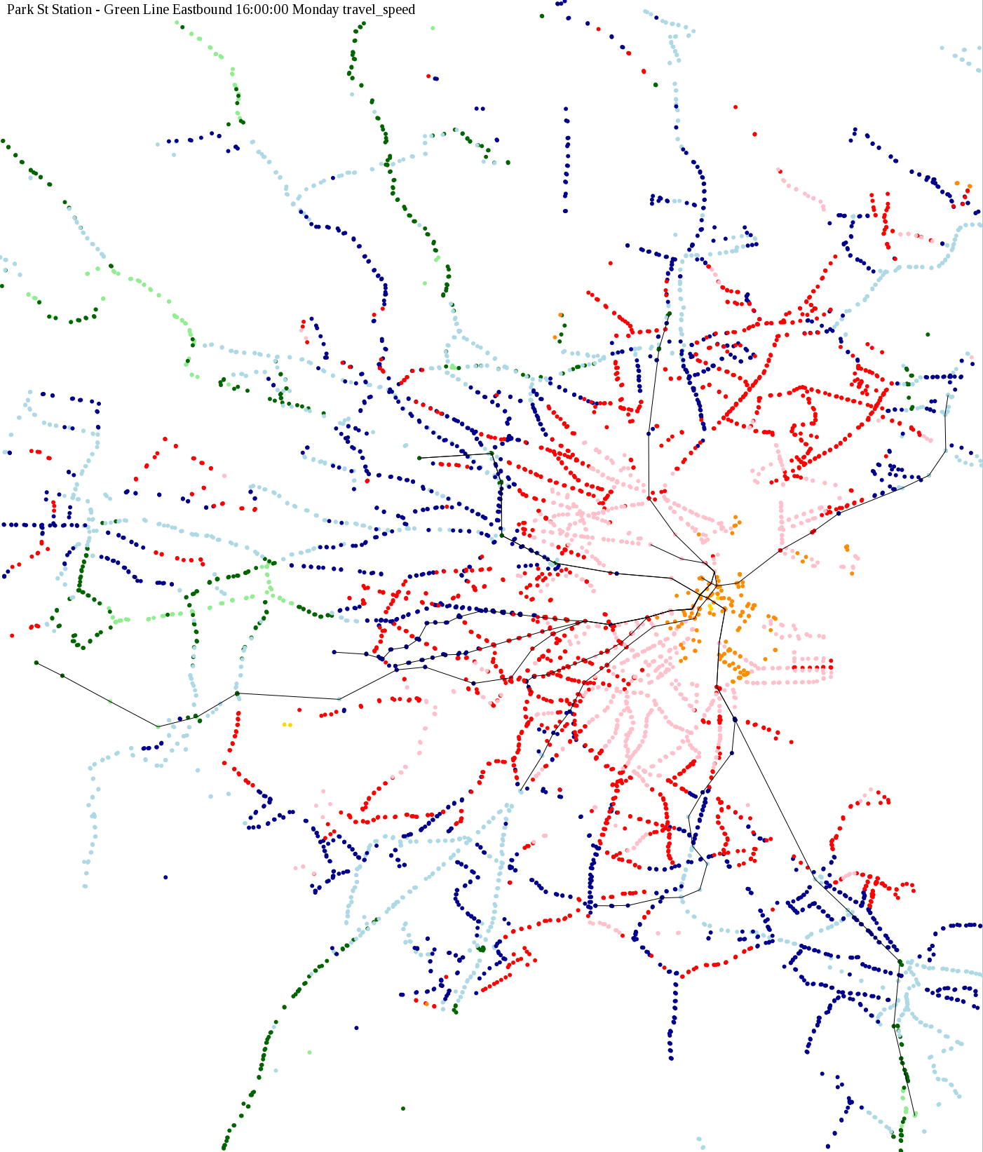
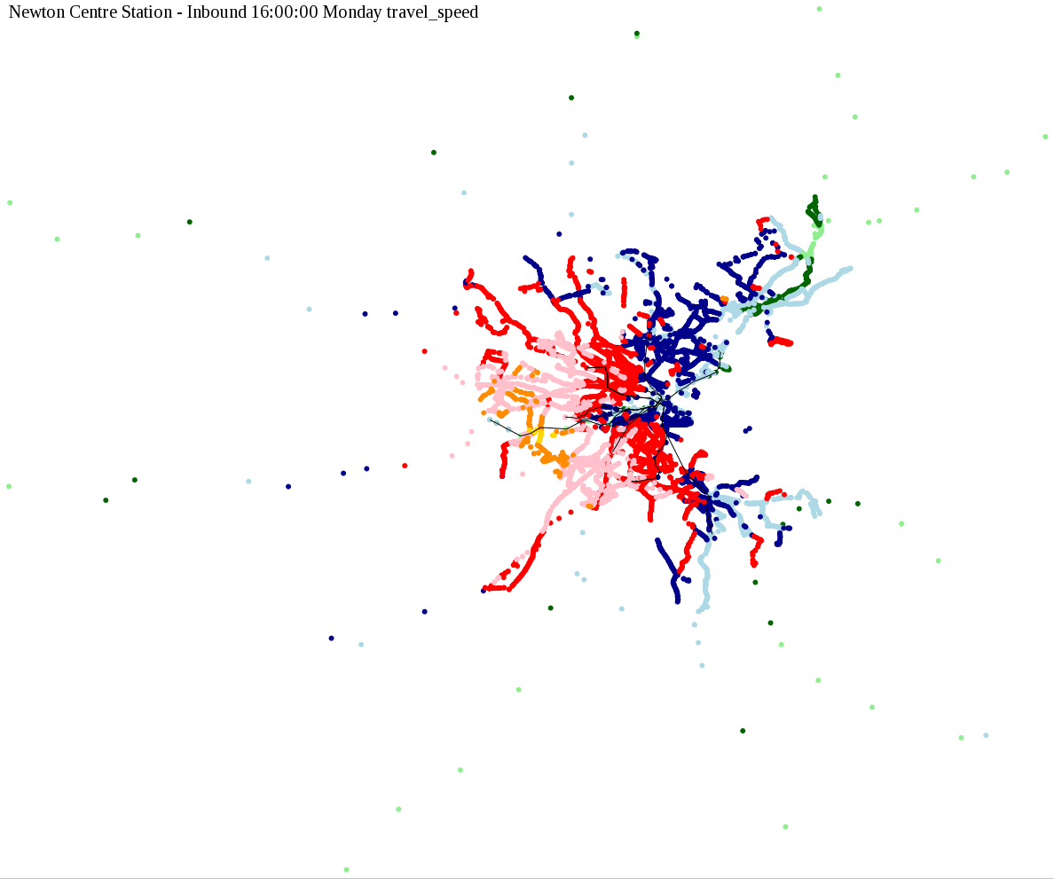
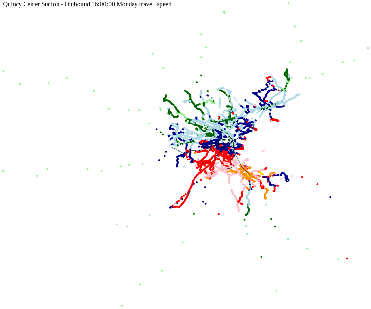
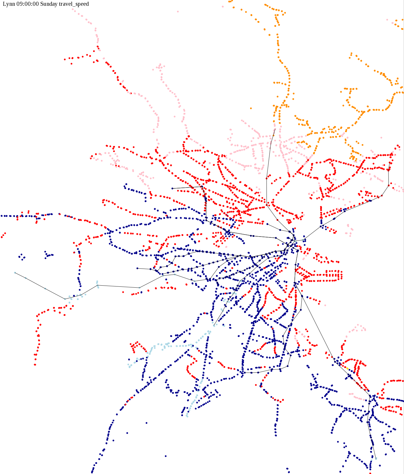
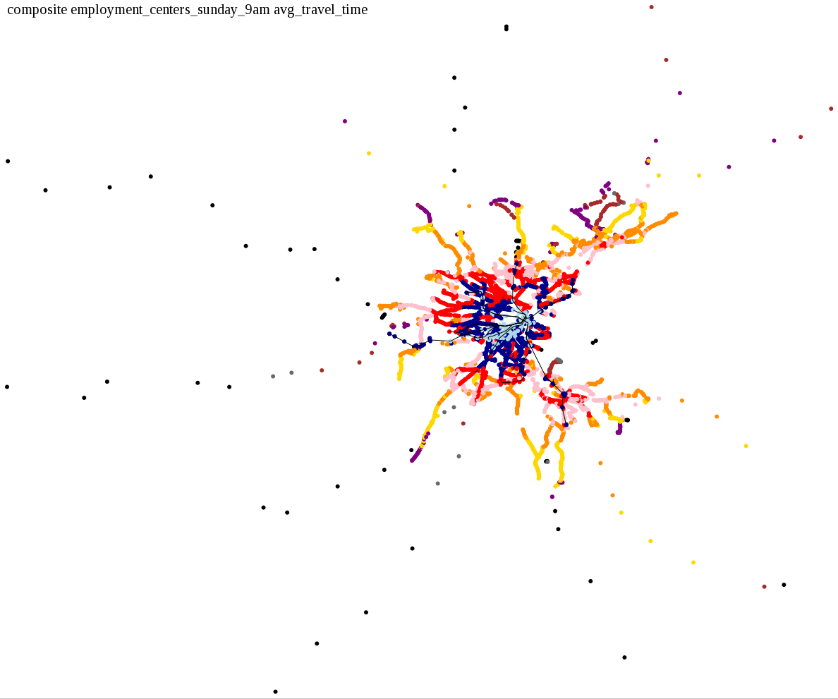
The maps below show how long it takes to get from one part of the MBTA system to another via the fastest possible route, and the average speed at which passengers travel along this route. Using the MBTA service schedules as of February, 2010, I created a simple simulation which tracks a theoretical passenger moving around the system, starting from a specific stop at a specific time. The idea for this exercise came out of the MBTA Rider Oversight Committee, which is using this visualization to find ways to improve transit service.
The Red, Orange, Green, and Blue Lines are drawn for reference. The "core" maps are zoomed into the area inside Route 128, which is densely populated with bus stops. The Commuter Rail lines can be clearly seen extending outward on the "full system" maps.
I chose a few stops out of personal curiosity to do my first few simulatations. I decided 9am Monday was a good time because it was relatively busy, and 9am Sunday was a time when relatively few services would be running. After that, I chose a set of core regional employment centers based on a MAPC Job Density map and ridership by station. In particular, the composite maps at the bottom show results averaged over my list of employment centers, approximating general connectivity to regional points of interest.
These maps are a work in progress. It should be fairly easy to draw municipal boundaries to make the maps easier to read. Another idea I am working on is to use population data to check for violations of the MBTA Service Delivery Policy.
| Color | Travel Time (h:mm) | Travel Speed |
| Light Green | 0:00-0:14 | 13-15+ mph |
| Dark Green | 0:15-0:29 | 11-12.9 mph |
| Light Blue | 0:30-0:44 | 9-10.9 mph |
| Dark Blue | 0:45-0:59 | 7-8.9 mph |
| Red | 1:00-1:14 | 5-6.9 mph |
| Pink | 1:15-1:29 | 3-4.9 mph |
| Dark Orange | 1:30-1:44 | 1-2.9 mph |
| Gold | 1:45-1:59 | 0-0.9 mph |
| Purple | 2:00-2:14 | |
| Brown | 2:15-2:29 | |
| Grey | 2:30-2:44 | |
| Black | 2:45-2:59 |
These maps show how long it takes to get from a starting point to anywhere in the system, in increments of 15 minutes. I also asked: How long does it take to get home from an employment center during the evening rush, or on Sunday morning when service is running relatively infrequently?
Playing Around:
Employment Centers - Evening Rush Hour:
Employment Centers - Sunday Morning:
Playing Around:
Employment Centers - Evening Rush Hour:
Employment Centers - Sunday Morning:
The following maps show average travel time from the seven employment centers (Harvard Square, Longwood-D, Back Bay, Park Street, Newton Center, Lynn, and Quincy Center).
The following maps show combined average travel speed from the seven employment centers (Harvard Square, Longwood-D, Back Bay, Park Street, Newton Center, Lynn, and Quincy Center).
The data source is the latest GTFS (Google Transit Feed Specification) files posted on the MassDOT Developers Page as of February, 2010.
The simulation assumes 2 minutes walking time inside a station (from one platform to another), and one minute of transfer time between vehicles on the same platform. Maximum walking distance is .25 miles, and the assumed walking speed is 1 mph.
The simulation is written in Perl. See the code ZIP file to get the scripts.
SVG versions of these maps are available in the svg directory, though these are not useful to most people. What is neat about them is that I can embed "tracers" so we can see per-dot details such as the output value for a particular stop, along with its name or ID number.
Some of my personal observations:
Special thanks to Christopher Dempsey and Joshua Robin at MassDOT for helping to make projects like this possible.
-- Beland